Selected career work

Selected work.

A selection of work from twenty-two years in senior product and design roles across some of Australia's largest retailers and marketplaces. Pieces one to five are work I did as an employee. The last one is a recent StackCraft client build, included because it shows what I ship hands-on now.

01

Coles Online, Unified Commerce

Coles, Group Design Manager, 2021–2022

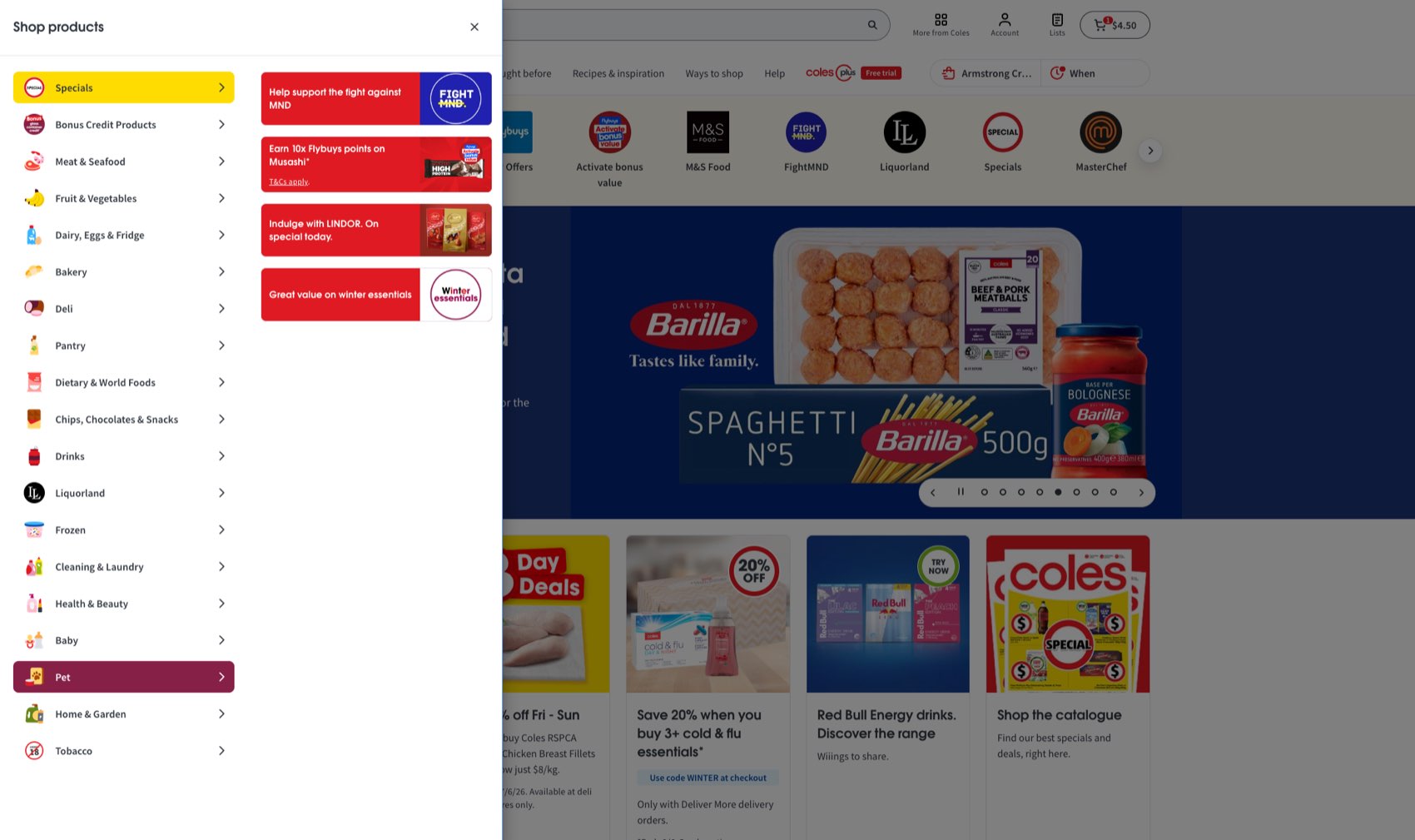
I led design for Coles' digital transformation, covering three C-suite pillar projects: a new web platform built from scratch, a differentiated mobile app, and a third-party marketplace. I reported to the GM of E-commerce. It started with getting two executives who owned competing websites to agree on what a single one should be, and the work below is what came out of that.

  • 41% Growth in supermarket ecommerce sales, FY22 The year the unified website and app relaunch landed.
  • $3.7B Annual online sales now carried by the platform Around 9.4% of group revenue.
  • 40+ Designers in the org, up from 10 in nine months Product design, research, service design, content design and accessibility.

Before any of it was funded

Two websites, two owners, two scoreboards.

The biggest part of this job came before the business case existed, and none of it was design. Coles ran two separate sites, each owned by a different member of the executive team, each doing well against targets that pulled in opposite directions.

Putting them together meant one of those scoreboards had to change. That is a much harder conversation than anything in the design work that followed.

  • coles.com.au The Chief Marketing Officer's site

    Digital catalogues, recipes, promotions and offers. Everything top of funnel, measured on reach and engagement.

  • shop.coles.com.au The Chief E-commerce Officer's site

    A pure ecommerce platform, measured on conversion, repeat customers and basket size.

What that took

Getting two C-suite owners onto one plan.

I spent months working through what a single experience would do for each of them, in front of both executives and their leadership teams. The version that landed had the marketing side feeding demand straight into the shop, and the shop giving marketing a much clearer read on what its content was worth. Neither had to give up the thing they were measured on.

That was the work. Building a shared vision out of two competing strategies, and holding it steady through the months it took to turn into a funded programme.

I count the business case as the real deliverable. All three pillar projects came out of it.

The remit

One shopping experience.

The re-platform put both sides in one place, so you could browse, get ideas and buy without having to move between them.

Alongside the platform work I led design strategy across Websites, Apps, Liquor, and Fulfilment and Operations, and set the Coles Design System strategy across brands.

What the work covered

  • A new information architecture across the catalogue
  • New navigation and search
  • Shoppable recipes, with ingredients added straight to the cart
  • Redesigned product detail pages
A new information architecture, navigation and search across the full catalogue.

The interesting bit

Shoppable recipes.

Recipe content where every ingredient goes straight into the cart, so a page that used to be marketing became somewhere you could actually shop from.
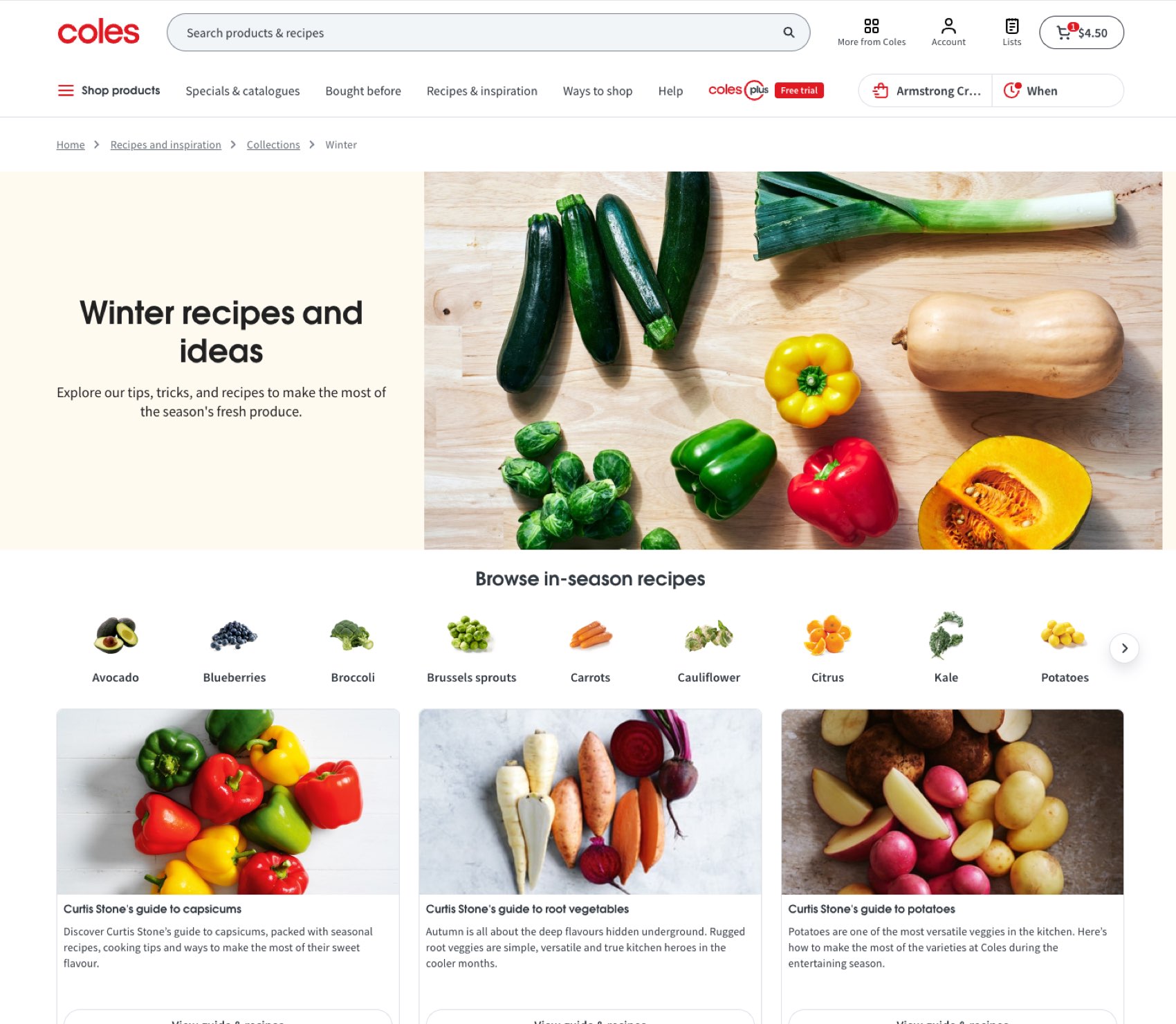
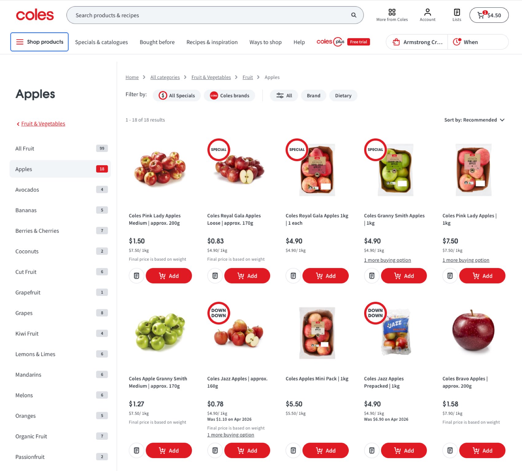
Shoppable recipes. Every ingredient into the cart in a tap.
Redesigned product and category pages.

The other half of the job

Building the org that could deliver it.

A relaunch of that size needed a design team that didn't exist yet. I grew the org from 10 people to more than 40 in nine months, then built the operating model that made the growth hold rather than just inflate the headcount.

What that meant in practice

  • Design operations, so 40 people could work without tripping over each other
  • Career frameworks, so the people I hired had somewhere to go
  • Ways of working across six product crews
  • A design system strategy that held across brands

Hiring 30 designers took nine months. Keeping them working well together is what I spent the rest of my time on.
  • C-suite Stakeholder Management
  • Business Case
  • Unified Commerce
  • Information Architecture
  • Search and Navigation
  • Shoppable Recipes
  • Design Leadership
  • Org Design
View

02

Coles SuperApp, Everyday Life Vision

Coles, Group Design Manager, 2022

A blue-sky vision and strategy piece for the Coles executive team, asking whether the full spread of Coles brands (grocery, health, insurance, mobile, fuel, financial services and marketplace) plus a set of partnerships could work as one lifestyle super-app, the way they do across a lot of Asian markets.

The challenge

Coles covers an enormous amount of ground, from grocery and health to insurance, mobile, fuel, financial services and marketplace. Each of those lived in its own app or channel. What leadership wanted to know was whether it could all become one thing, and if so, why and how.

I worked hand in hand with the exec suite to pull the vision together, and tied it back to the five year growth plan. That mattered. It meant they could weigh it against everything else on the table instead of filing it under interesting.

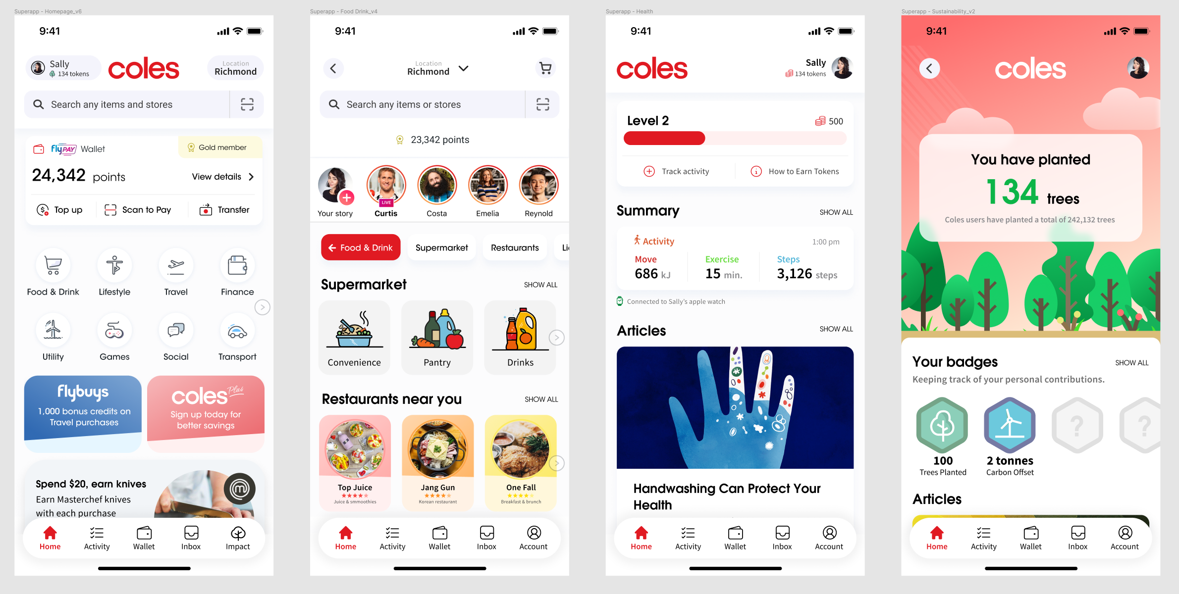
Three areas designed in depth: the hub, Food and Drink, and Activity and Sustainability. Enough detail to make the idea concrete for executives.

The approach

One app for everyday life.

I mapped out the everyday-life categories Coles could either own or partner into, covering Food and Drink, Lifestyle, Travel, Finance, Utility, Games, Social and Transport, then designed three of them end to end so there was something real to look at rather than a diagram.

The integrated journey

Sally's family holiday.

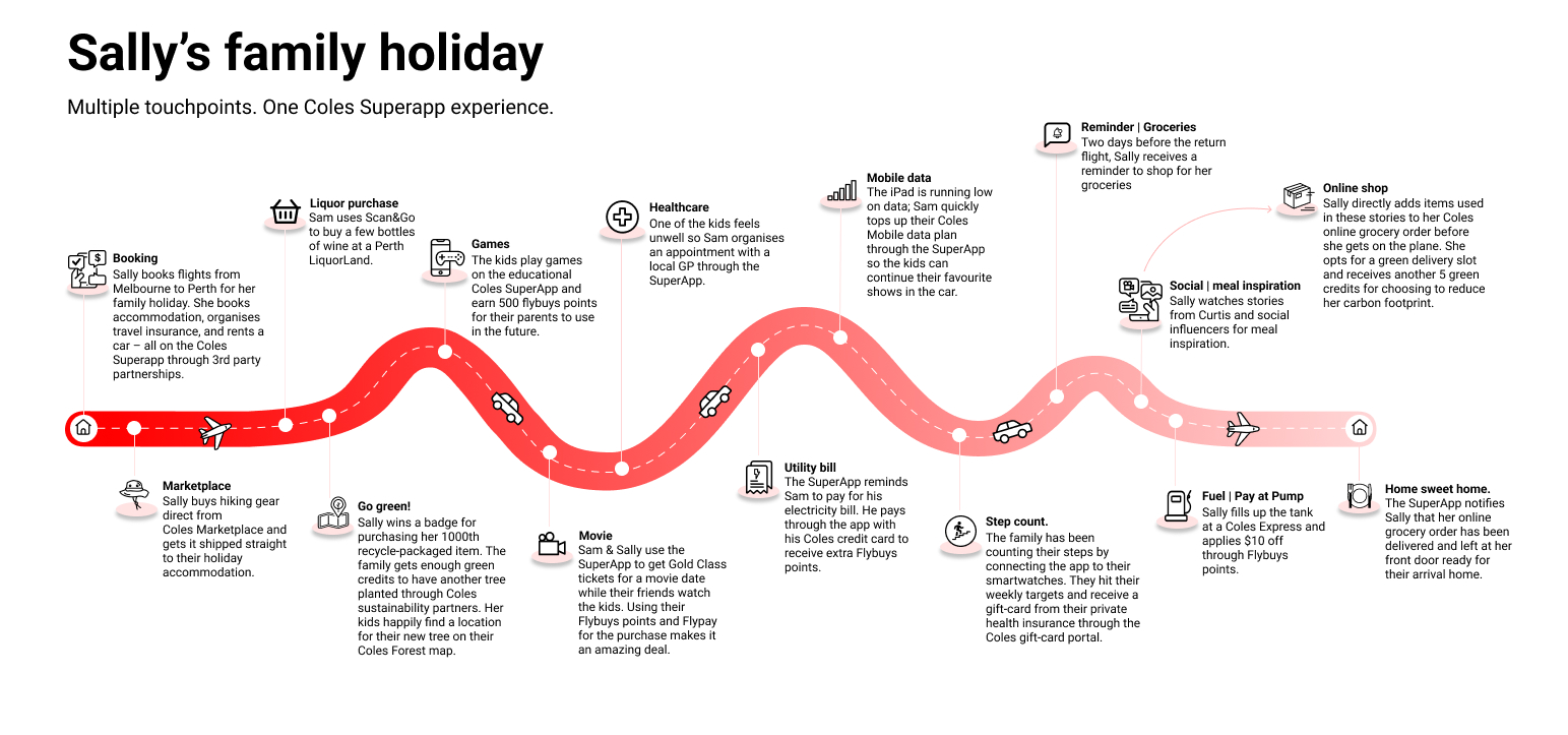
A single journey running end to end through the whole thing. Travel booked through partners, green credits that plant trees on a Coles Forest map, health rewards tied to a wearable, and payments and fuel built in through Scan&Go and Pay-at-Pump.

Sally's family holiday, running through booking, green credits, health rewards, payments and fuel.

This was built to help the executive team decide whether to make the bet, so it was never meant to ship.

The outcome

It gave a fairly abstract ambition enough shape that leadership could actually weigh it up.

  • Super-App
  • Product Vision
  • Strategy
  • Executive Alignment
  • Service Design
  • Design Leadership

03

Myer, Department Store Online

Myer, Customer Experience Leader, 2020–2021

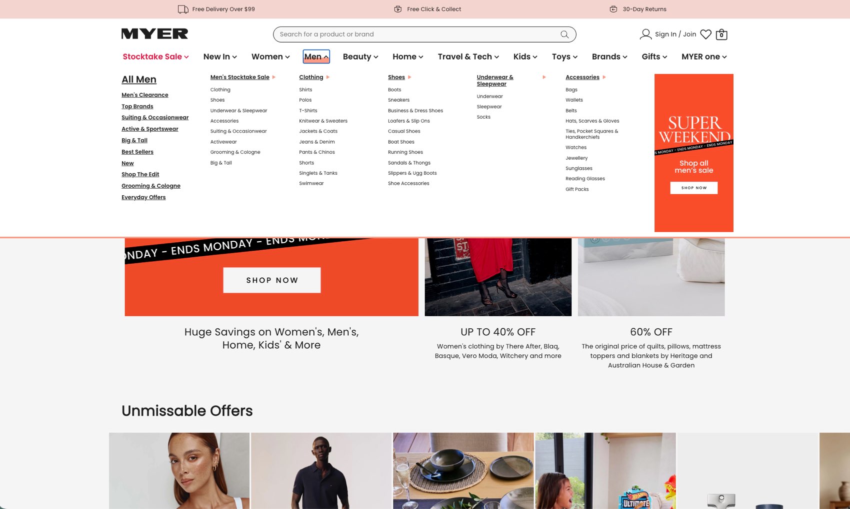
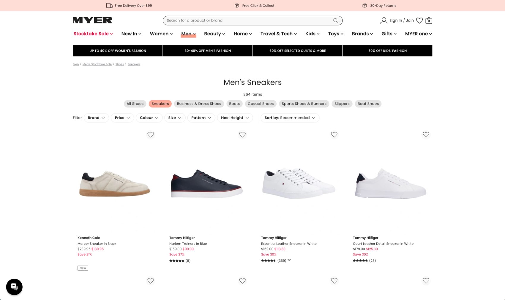
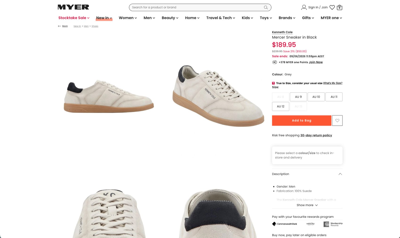
A redesign of the Myer department store experience, covering a new information architecture, navigation and search, and redesigned product detail pages. I owned CX, UX and research inside the ecommerce leadership team, managing six designers and a researcher, reporting to the Head of Digital.

  • +3.5pp Conversion lift from the navigation redesign Navigation sits in front of everything, so a lift there carries through the whole catalogue.
  • 7 Designers and researchers in the team I ran
  • PDP and checkout Delivered alongside the navigation work

The remit

A department store, made navigable.

A department store carries an enormous number of categories and brands. Most of the work went into making all of that easier to move through and buy from.

What the work covered

  • A new information architecture
  • New navigation and search
  • Redesigned product detail pages
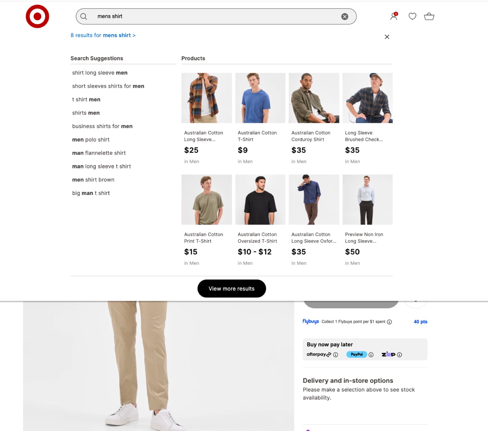
A new information architecture, navigation and search across the department store catalogue.
Redesigned browse and product listing.
Redesigned product detail pages.

Beyond the screens

The parts that made it repeatable.

Alongside the redesign I ran enterprise customer journey mapping and the Voice of Customer program, and set up continuous research operations so the team stopped guessing between projects.

Operating basics I put in place

  • OKRs, so the team could tell what was working
  • Lean Canvas for framing new bets
  • Lifecycle mapping across the customer journey
  • Design system adoption across the ecommerce estate
  • Information Architecture
  • Search and Navigation
  • Product Detail Pages
  • CX Leadership
  • Research Ops
  • Retail
View

04

Target Australia, Store Online

Target Australia, Head of UX, 2018–2020

A rebuild of the Target Australia store experience, covering a new information architecture, navigation and search, and redesigned product detail pages. Alongside it I built the UX function out from four designers to fourteen, reporting to the GM of E-commerce.

  • 14 Designers in the UX function, up from four Including Target's first dedicated UX researcher and first UI designer.
  • 2 Strategic transformation areas I led Both reported into monthly board meetings.
  • NPS, CSAT, CES The measures I made the team work to

The remit

Rebuilding the store online.

A rebuild of Target Australia's store experience, with most of the effort going into search, browse, and shortening the path to the right product.

What the work covered

  • A new information architecture
  • New navigation and search
  • Redesigned product detail pages
A rebuilt search experience, aimed at the shortest path to the right product.
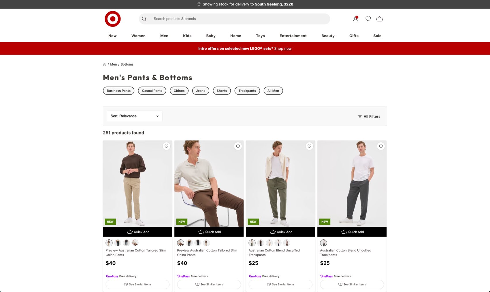
Redesigned browse and product listing.
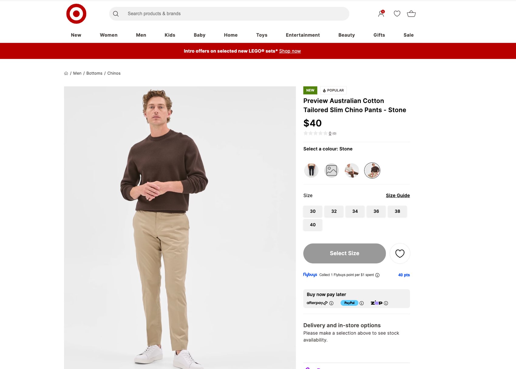
Redesigned product detail pages.

The wider job

Moving UX out of product.

I moved the UX function out of product and into the ecommerce leadership team, so design was in the room when the trading decisions were made. From there I led two strategic transformation areas that reported into monthly board meetings.

I widened the function's scope to cover the mobile app and the store delivery teams, and led mobile app and omni-channel experience strategy across both.

What I set up to make it stick

  • UX principles and goals the team was measured against
  • A mentoring culture, and a career development framework
  • Target's first dedicated UX researcher and first UI designer
  • NPS, CSAT and CES as the shared measures of success
  • Information Architecture
  • Search and Navigation
  • Product Detail Pages
  • Head of UX
  • Team Building
  • Omni-channel
  • Retail
View

05

SEEK Mobile App Upgrade

Seek, Senior UX Designer, iOS and Android, 2015–2018

The full upgrade to SEEK's mobile app across iOS and Android, covering apply, search and profile. I was the only designer on it, from research through to launch.

  • 75% Rise in job applications completed on mobile
  • 1.5M Mobile job applications every month, after launch
  • $1B SEEK passed a billion in revenue for the first time Over the same period. The app was one contributor among many, but it was the channel the growth was moving to.

My role

Sole designer, end to end.

I owned research, UX and visual design as the only designer on the project, working closely with engineering on the build and with product on strategy.

  • Owned

    Research, UX, visual design, IA and prototyping

  • With engineering

    Feasibility, build, on-device testing and rollout

  • With product

    Strategy, prioritisation and success measures

Why this mattered

Around 60% of all SEEK traffic was already on mobile, but applying still finished on desktop. You could browse jobs in the app and then had to go somewhere else to do anything about it.

Applications are what the whole marketplace runs on, so that gap cost SEEK money every day it stayed open.

The job was to make applying something you could finish on your phone.

Where we started

The original app.

Limitations I set out to fix

  • Apply was locked to a single default résumé, with no way to add, edit or remove CVs.
  • The profile was thin and didn't influence what you were shown.
  • The visual language was dated and out of step with SEEK's brand.
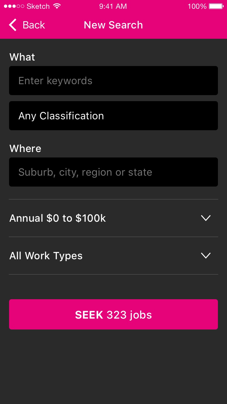
  • Search and activity were buried in a heavier IA.
The original app. A single default résumé, a thin profile, and search buried a few levels down.

The strategic bet

The bet, and two threads of work.

If candidates could build and tailor their profile, CV and cover letter on their phone, they'd apply where they already were, and SEEK would stop losing those applications to desktop.

  • Thread 01 Personalisation

    Use the profile as the engine. Better data going in means more relevant jobs coming out, and recommendations plus saved and recent searches make every return visit quicker.

  • Thread 02 Conversion

    Take friction out of applying. Manage multiple CVs, pre-fill what we already know, cut the number of steps, and point people toward searches that return more.

How I approached it

Research first.

  1. 01 Information architecture

    Card sorting, to find out how candidates expected the app to be organised, in their own words.

  2. 02 Preference and priority

    In-person sessions on which features mattered most, so we could sequence the build around them.

  3. 03 Usability testing

    Testing new designs to catch friction before anything reached the build.

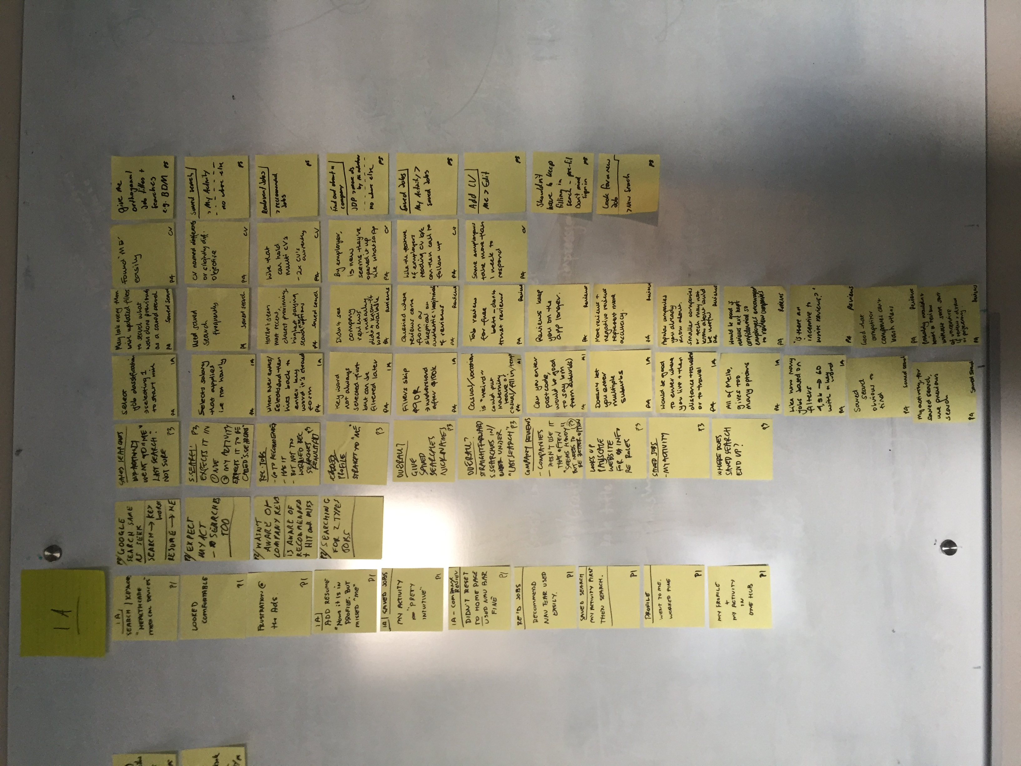
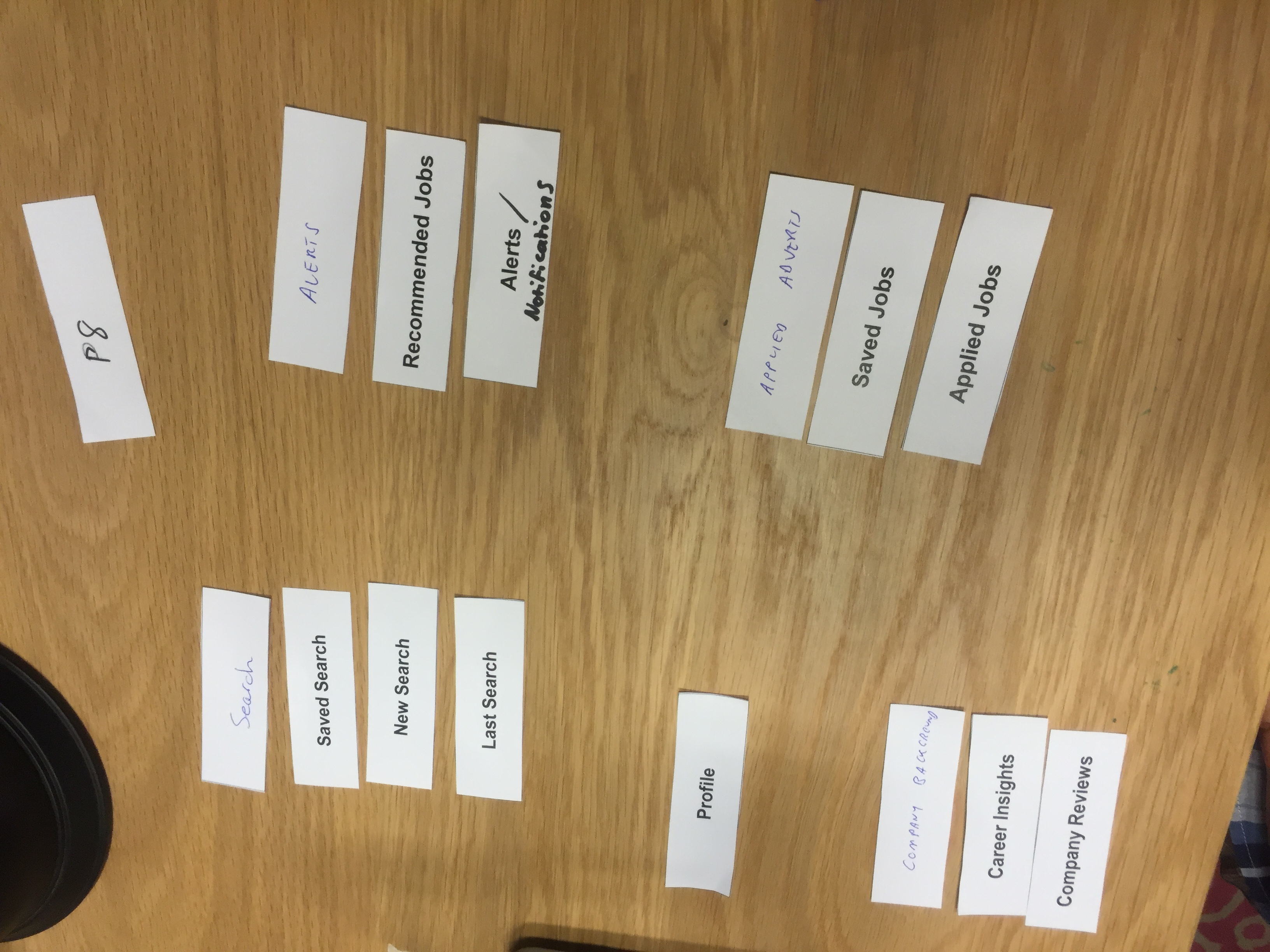
Research in the room

Synthesis and card sorting.

The affinity wall from synthesising sessions, prioritised P1 to P5. Alongside it, an open card sort showing how people group search, alerts, activity and profile.

From research to principles

What the research told us.

  • “Resume means me.”

    Make it personal, with one place that holds your profile and your activity.

  • “I keep two CVs right now.”

    Let people hold and tailor more than one CV and cover letter.

  • “Don't make me re-enter my search.”

    Cut out repetitive input and pre-fill what we can. Signing in is fine if it saves effort.

  • “Show me what's new.”

    Lead the return visit with recommendations and recent or saved searches.

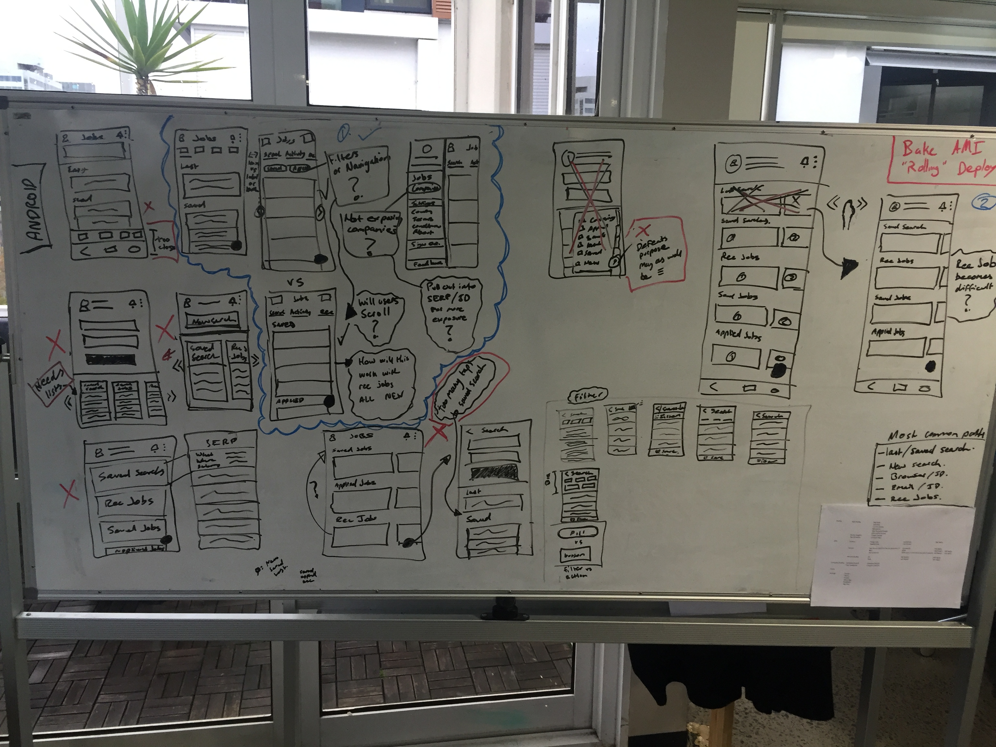
The messy middle

Exploring the structure.

Working through navigation, the most common paths, and what to cut.

Questions I worked through

  • Filters or navigation?
  • Will users scroll for recommendations?
  • How do saved, applied and recommended coexist?
  • What's the most common path, and how short can we make it?
Mapping navigation, the most common paths, and what to cut.

From card sort to structure

A simpler information architecture.

  1. 01 Search

    New, saved and last searches

  2. 02 Recommended

    Personalised jobs and alerts

  3. 03 Activity

    Saved and applied jobs

  4. 04 Profile

    The 'me' hub, plus CVs

  5. 05 Companies

    Reviews and insights

Profile sits at the centre of it. It's the 'me' hub people asked for, and it's also what feeds the recommendations.

Conversion by design

Search that gets people further.

Designed to lift result quality

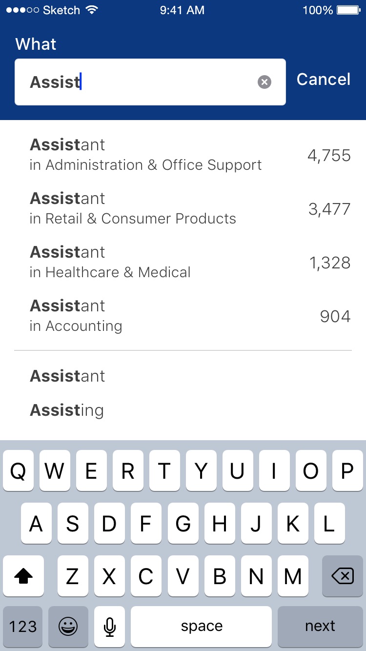
  • Type-ahead combines keyword and classification in one step.
  • Live job counts steer people toward searches that return more.
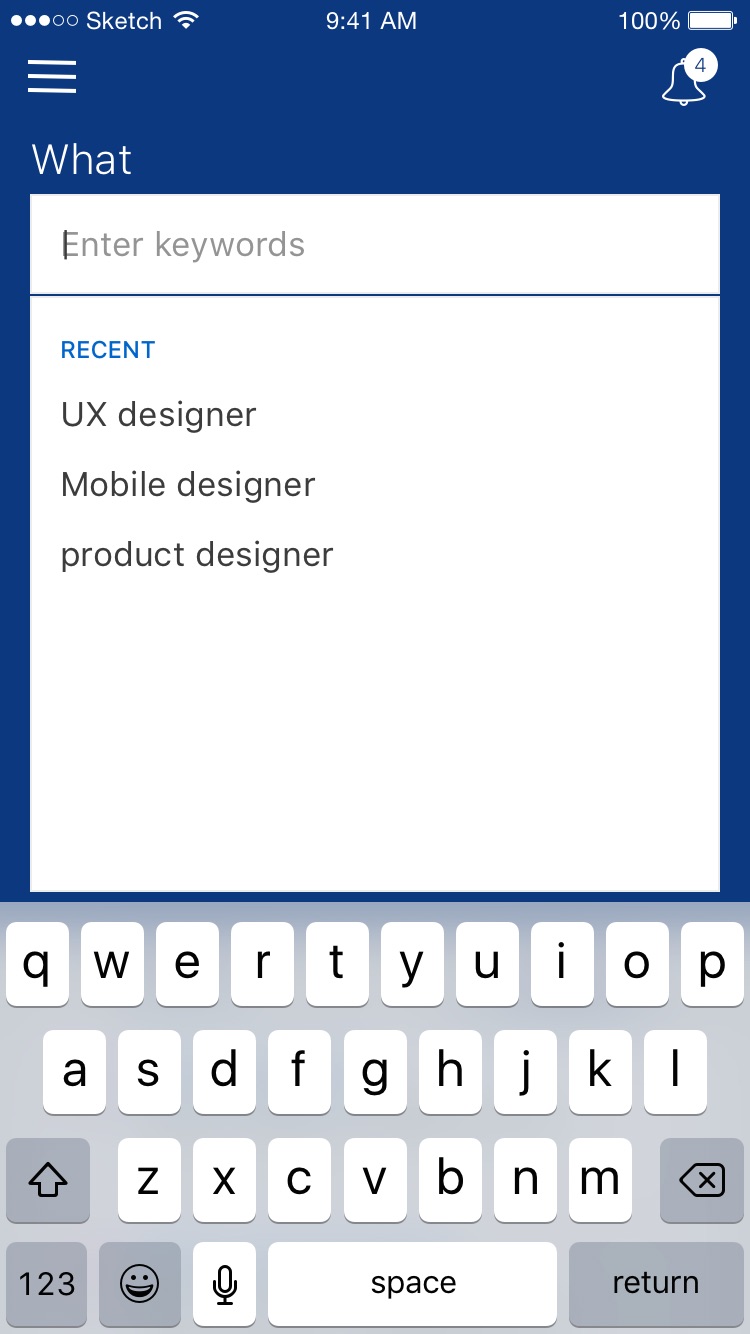
  • Recent searches remove repetitive typing.
  • More relevant results, and more applications actually finished.
Type-ahead combining keyword and classification, with live job counts and recent searches.
Combined search in action, with keyword and classification together and live counts.

Personalisation

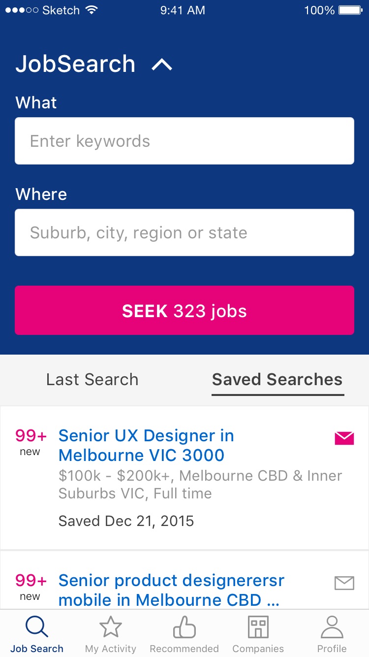
A home that knows you.

What the home screen does

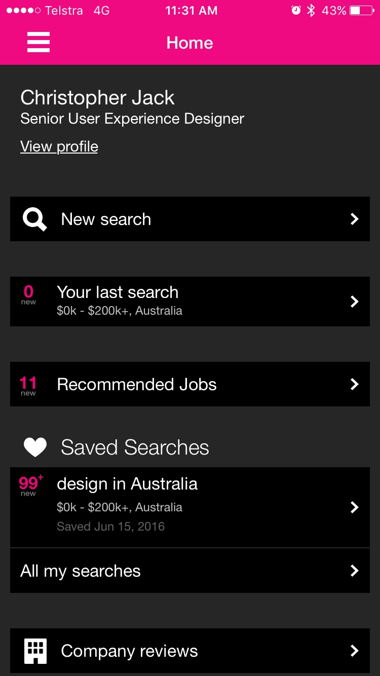
  • Greets you and leads with your recent and saved searches.
  • Recommended jobs surface relevant roles without a search.
  • Saved searches show counts of what's new.
  • Everything on it is there to make coming back worthwhile and to shorten the time to apply.
A personalised home leading with recent and saved searches, plus recommended jobs and the results feed.
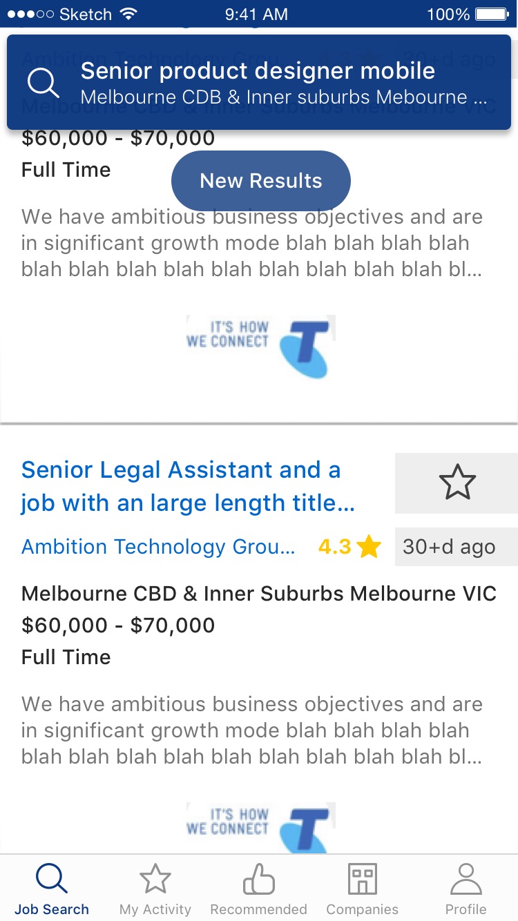
Header interaction on the results feed.

The centrepiece

The apply flow.

  • Upload, edit and remove multiple CVs rather than one default résumé.
  • Tailor a cover letter in the app, per application.
  • Import versions from Dropbox and Google Drive.
  • Track saved and applied jobs in one place.
  • Pre-filled forms cut down the steps between deciding to apply and submitting.

If you asked me what drove the 75% lift, I'd point at this first.

Concept to delivery

Shipping it.

Getting it built and out

  • Partnered daily with engineering and tested on real devices.
  • Designed for native iOS (HIG) and Android (Material) in parallel.
  • Soft-launched the new apply experience in March 2017.
  • Iterated after launch as adoption data came in.

The payoff

What it did.

  • 75% More applications completed on mobile, each day Down to removing friction in apply and letting people tailor CVs.
  • 86k / 68k CVs uploaded, then deleted, after launch People actively tailoring per role, which is what we were after.
  • Fewer, better Applications went from spray-and-pray to considered Personalised search and profile guiding intent.

What else moved

  • Account creation and engagement both lifted, which gave the recommendations more to work with.
  • Downloads and app store ratings rose alongside them.
  • Data-driven optimisation became part of how the mobile team worked week to week.

What's next

Where I'd push further.

I'd take the profile further into a proper preference engine. Capture richer signals like salary, role type, location and how someone wants to work, then feed those straight into the recommendation and search algorithms so the profile actually shapes what each candidate sees.

Research through to a shipped product, with a measurable change in how people applied.

  • Mobile App
  • iOS and Android
  • UX Research
  • Information Architecture
  • Conversion
  • Personalisation
View

06

Lucar, Fifty Years of Paper

Lucar, Design and build, via StackCraft, 2026

A Melbourne manufacturer of refrigerated trailers had tracked its work on paper time cards for about fifty years, typed into a spreadsheet that was always a day behind. I replaced the lot with tablets on the workshop wall and a live dashboard in the office. Fixed price, four weeks, designed and built end to end by me.

  • 4 weeks From nothing to a working system in the building Fixed price, with the scope agreed up front.
  • ~30 Workshop staff logging time on it every day Plus a handful in the office.
  • Live Where the office used to wait a day for its numbers

The problem

Fine until you want to know something.

A worker wrote their start and finish times on a paper card, the card went up to the office, and someone typed the lot into a spreadsheet. It worked the way paper always works, which is fine until you want to know something. How many hours are on that job so far? Which builds are running over? Who's still clocked on? The honest answer to any of those was give me until end of day.

The floor was never the problem. The floor was very good at building trailers. The problem was that everything those people did turned into a pile of paper that only became useful after someone had re-typed it a day later into a sheet nobody entirely trusted.

They weren't after a transformation. They wanted the paper gone.

How I took it on

Fixed price, tight scope.

I'd rather agree exactly what finished looks like up front than sell someone an open-ended project and a monthly invoice. Four weeks isn't long, but it's enough if you're strict about what goes in.

What I built

Two halves, one system.

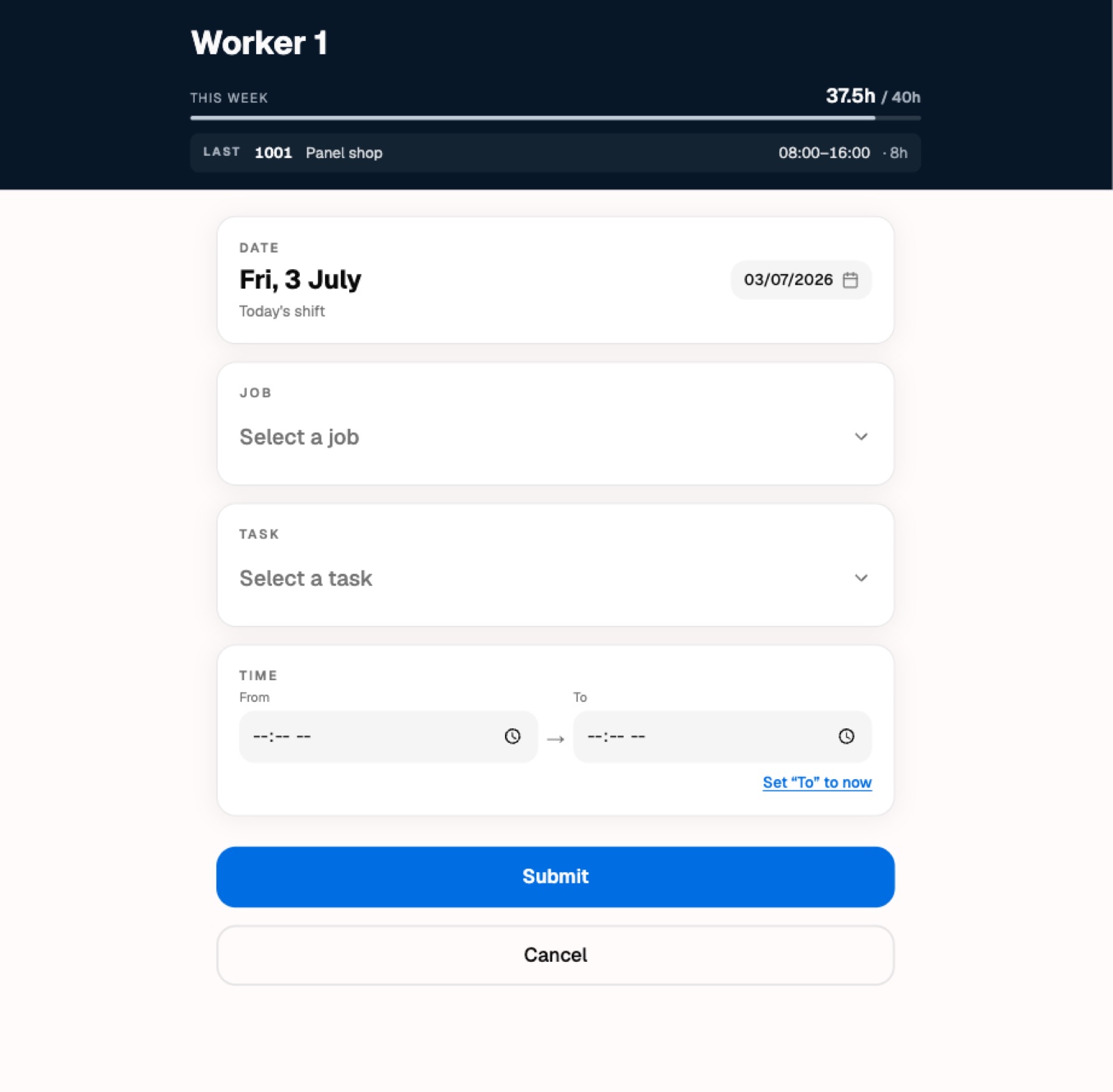
The first sits on the workshop wall. Tablets, mounted where people already walk past. You tap your name, tap in a short PIN, pick the job and the task you were on, enter your hours, and walk off. No accounts to remember, no app to install, no fiddly typing.

The floor tablet. Name, PIN, job, task, hours. About fifteen seconds with gloves on.

The office half

A screen that's just current.

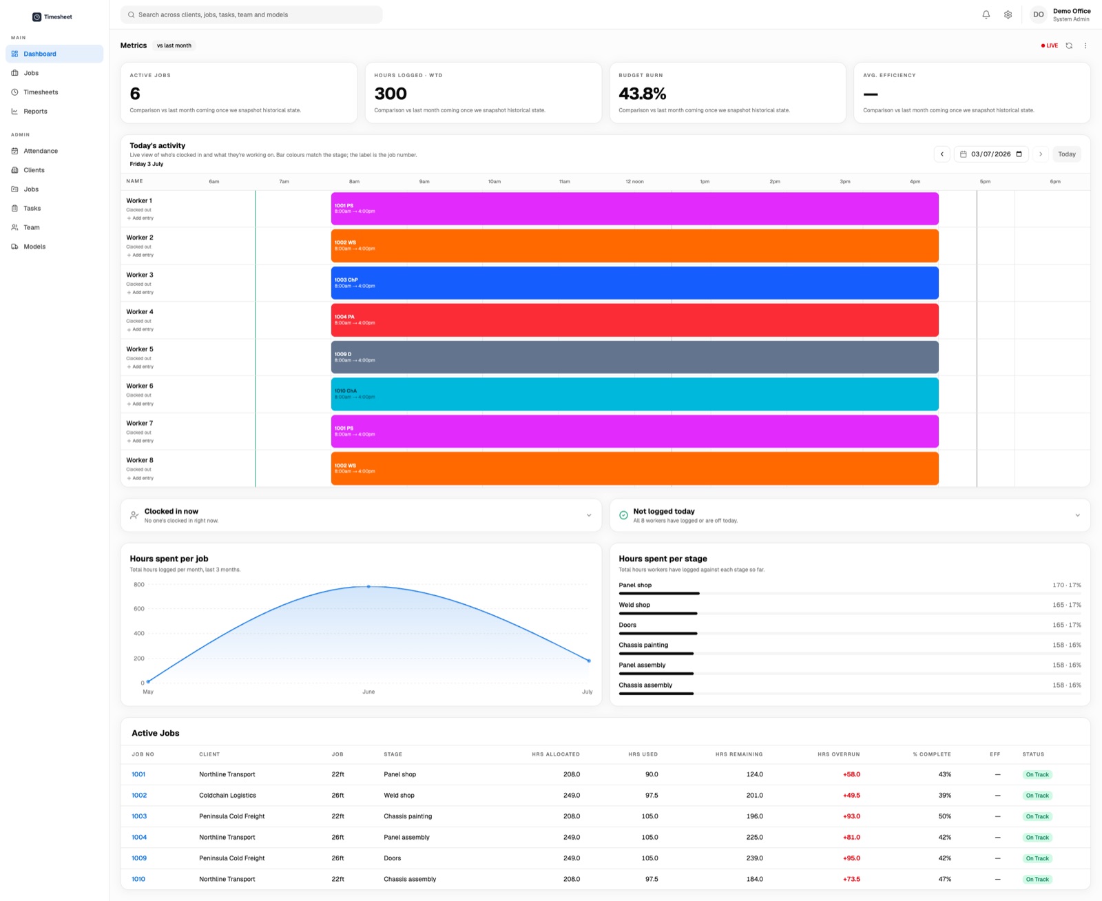
The moment someone logs time on the floor, the office can see it. Hours against each job, which builds are tracking over their estimate, who's clocked on today, where every job sits against the hours it was quoted at. The spreadsheet and its day of delay became a screen that's just current.

The office dashboard. Who's clocked on, hours logged against each job, and which builds are tracking over estimate.
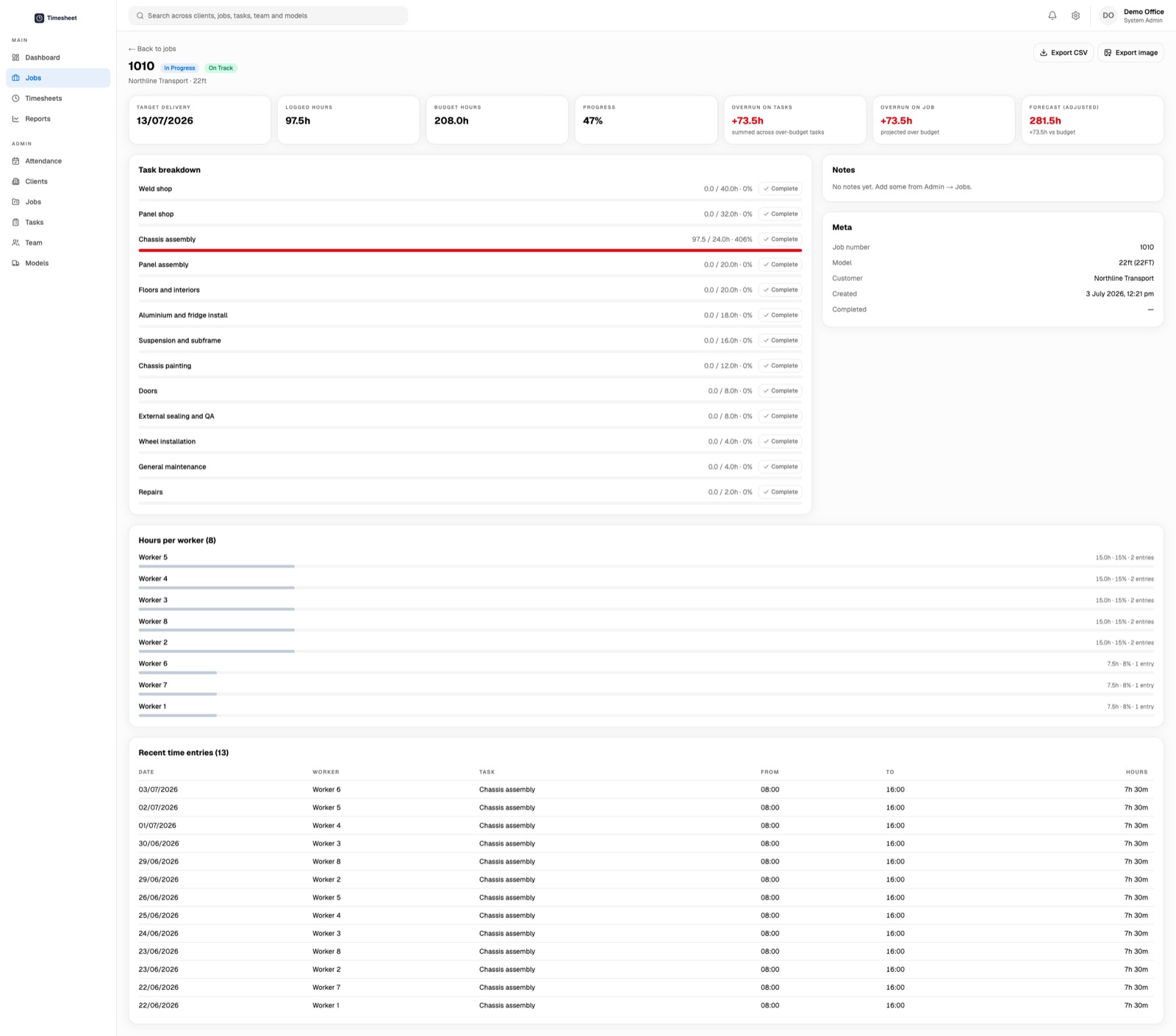
Each job against the hours it was quoted. The red bar is a task running well over estimate, visible the moment it happens rather than at month end.

The commercial point

Quoted hours, watched in real time.

A fixed-price trailer build either lands inside its quoted hours or it doesn't, and until now they found out which at month end, when it was too late to do anything. A task running hot now shows up the day it starts running hot.

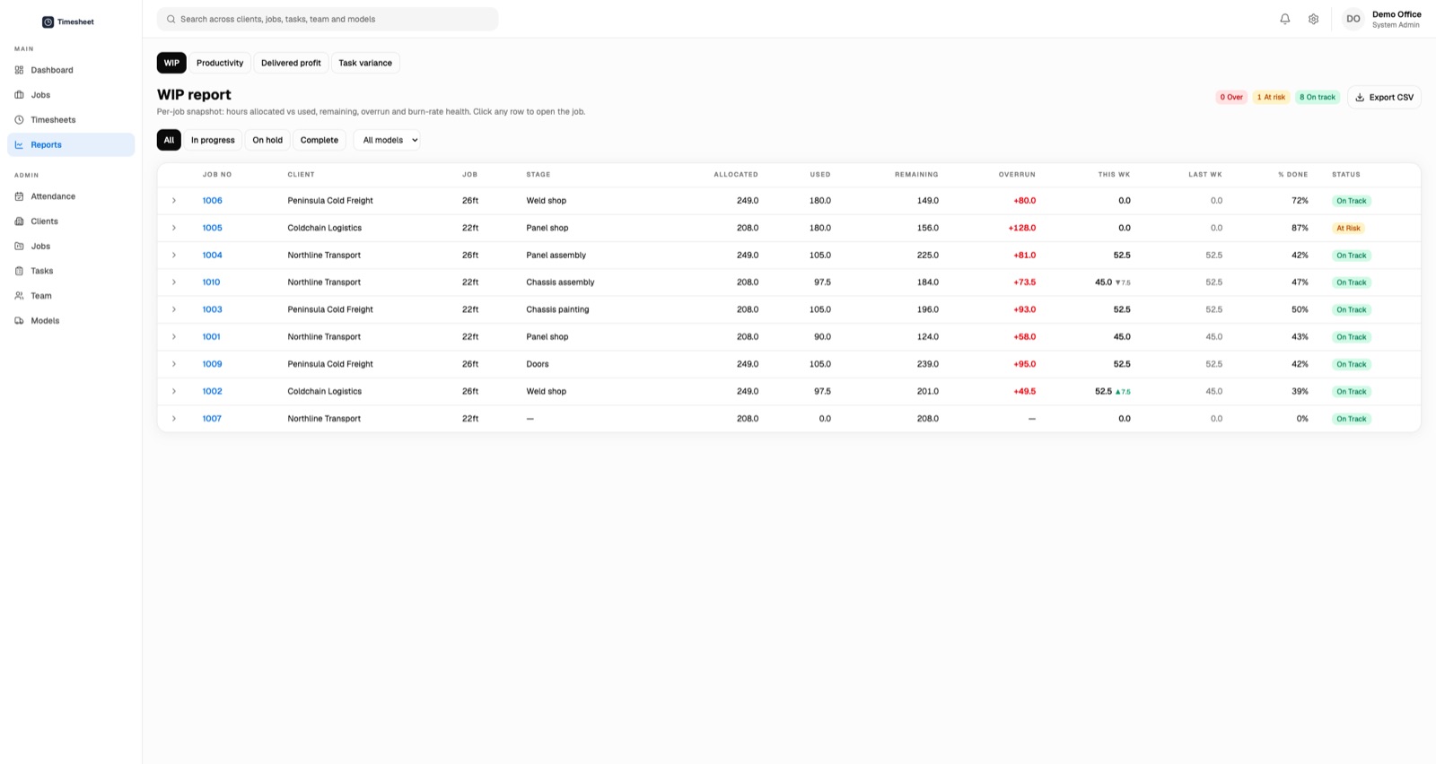
The WIP report. Every job's burn rate at a glance, exportable so the numbers can leave the building.

Where the real work went

Things that don't demo well.

Writing software that saves a time entry is easy. Writing software that a person in a loud workshop, wearing gloves, at the end of a long shift, will actually use every day without being nagged about it is a different job entirely.

So most of the effort went into

  • Making the buttons big enough, and the flow forgiving when someone taps the wrong thing.
  • Keeping it working when the Wi-Fi drops, because in a metal shed it will.
  • Getting the timezone right, so the day starts and ends when Melbourne says it does.
  • Taking the lunch break out automatically, so nobody has to remember to.
  • Making sure several tablets in use at once never step on each other.

A floor that's run on paper for five decades doesn't owe your software any trust. You earn that by being reliably boring.

After go-live

Where it actually got good.

The four weeks got us to a working system, which is the start rather than the finish. The most useful stretch came once real people were using it in the real building.

What real use surfaced

  • The office needs to add a shift for someone who forgot to clock in.
  • A worker wants to log one task then another without walking back to their name.
  • Setting your finish time to now should be one tap rather than a fiddle.
  • The most important button on a form is sometimes Cancel.

None of that was in the original scope and all of it mattered. Scoping tightly doesn't stop things changing. What it does is keep the first version small enough that you reach the real feedback quickly.

The outcome

The quieter win is trust.

The obvious win is that the paper is gone and the office has a live picture instead of a day-old one. The quieter win is that the numbers are current, so people believe them, so they get used to make decisions instead of sitting in a drawer.

There's no AI in this build and nobody on the floor asked for any. It's a well-made tool for a specific job, and that turns out to be the whole point.

  • Product Design
  • Full-stack Build
  • Manufacturing
  • Fixed-price
  • Offline-first
  • Internal Tools
View

Most of these were roles I held as an employee. The last is a StackCraft client build.